European Manor House Plan Review
This is a review of plan this European Manor House Plan (no W36337TX from Architectural Designs). I use the information and procedure laid out in the floor plan analysis section.
First impressions? Wow – what a whopper - with bacon and cheese! Let’s take a floor plan tour and discuss the design of this house a little...
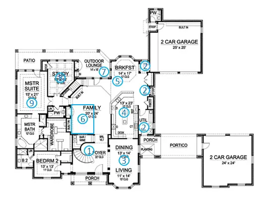
European manor house plan review - ground floor
- The main entrance is nothing less than majestic. There’s a porch to shelter you from the rain and once inside the staircase and double height atrium are impressive indeed. I guess if you’re in Texas you maybe don’t need a closet for coats. In colder climates there might be a case for using some of the space under the stairs or in bedroom 2 for storing coats.
- There are 3 other entry points, perhaps more family entry spaces. The entrance from the top set of garages is conveniently near the kitchen for bringing in groceries and the little vestibule area makes the entrance into the kitchen/breakfast area feel gradual. There's a comforting stoop at the entrance straight from the outside and there's a closet to the right of that door for coats. The third entrance comes through the utility room which might not be ideal. In houses this size, it's perhaps more practical to have a laundry space in a separate room. Maybe the foot traffic from the bottom set of garages could be sent up to the back door via a covered walk way.
- There's plenty of room to entertain guests in the living / dining area. The dining area is closely connected with the kitchen without the kitchen being visible. The location of the guest bath means that guests will need to walk through the family room and kitchen.
- The kitchen is large enough to accommodate a center island. This arrangement always feels luxurious and there's loads of kitchen storage. Because of the size the appliance layout needs to be carefully thought through to make sure you're not walking 2K to prepare a meal. The refrigerator, cooking surface and sink in the island form a functional kitchen triangle. The dishwasher and large sink form a coherent washing up area. I think the oven could be put in a better position to be closer to the kitchen triangle. Perhaps along the same wall as the cook top, perhaps by introducing a range. Last but not lease, the desk would come in very handy but at the moment it's caught up in the kitchen action due to the location of the oven - move the oven and that will be sorted out. The kitchen is in the center of the house so the back of it will feel dark while the light from the family room and breakfast nook will prevent it from feeling like a cave.
- The breakfast nook with its sunken ceiling will be a lovely place to eat - particularly if there's a great view.
- The family room is in the middle of the home with rooms on 3 sides. There's 5 circulation points meeting at this room (front entry, outdoor lounge, second staircase, kitchen/breakfast, master suite). This circulation means that the effective area of the family room is much smaller than it looks - about the size of the blue box I've put on the image. It's just something to be aware of. The natural furniture arrangement here would orientate the couch towards the fireplace and TV which presumably would fit in the built in next to the fireplace. The built in on the 45 degree wall on the back of the second stair case might be a bit far away for ideal TV viewing distance and anyone walking into the master suite or study would interrupt the view of the TV. There's not really a good place in the family room to sit and enjoy the view to the outside.
- A fireplace in the outdoor lounge is a great idea. Perhaps the door to the outdoor lounge would be better moved one panel to the right and opening to the outdoors onto the breakfast nook windows (with a good door stop of course to prevent the windows breaking). This would leave a larger area for furniture in front of the fireplace, not interrupted by circulation.
- There's several options for locating the desk (or desks) in the study. A slight change in the orientation of the stair case to prevent the corner being cut out of this room would make it bigger and perhaps a candidate for being an extra living space - maybe a TV room or library rather than a study. Bedroom 2 might be a more appropriate size and location for a study / office space.
- So no onto the master bedroom. The windows on the wall are well positioned so that the bed would fit between them and there's room for some seating to sit and look out. The master bathroom has ample space and storage with a separate WC, large tub and large shower. Then it's through to the huge walk-in closet. Just be aware that this closet has no natural light and it's a long way to go from the kitchen to the closet if you've forgotten something.
I think spending some time on thinking of different layouts for the bottom left section of this floor plan (taking into account your needs) to improve the location of the guest bath and the layout of the master suite might yield some interesting design options.
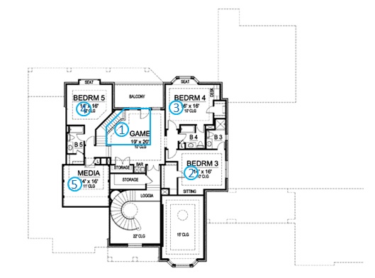
European manor house plan review - first floor
Now for upstairs...
- The game area at the top of both stair cases has a reduced effective area due to circulation (effective area indicated by box) much like the family room below it. The balcony and game room might benefit from moving the door over to the right.
- Bedroom 3 is a nice size. The door opens onto the wall of the closet which can make the entrance to the bedroom feel a bit abrupt. I feel like the layout of bedroom 3 makes it a bit difficult to know where to put the bed. The best place looks like straight under the window - so maybe puting two small windows that would go either side of the bed might be a solution here. Another idea would be to get rid of bathroom 3 and make a larger bathroom shared by bedroom 3 and bedroom 4 with the entrance from the little vestibule outside both rooms, then the bed could go along the bathroom wall.
- Bedroom 4 would make a great room with the lovely window seat and desk alcove. Lots of character. The only negative is the fact that the door would open directly on to the pillow end of the bed. This could be resolved by the change suggested above of combining the bathrooms. This would allow the bed to go along the bathroom wall, or for the bathroom to take up less space and allow the bedroom door to be more central to the room, avoiding the 'opening onto the pillow' situation.
- Bedroom 5 also has a charming window seat but no closet. The right hadn wall would be an ideal place for this. The dropped ceiling would have to be altered, and perhaps the position of the window so that these elements remain centered in the room once the built-in closet was added.
- And for the icing on the cake it looks like the media room would be like a cinema with a graduated ceiling and all! Of course there's no reason that this room couldn't be used as an extra bedroom provided that a window was added. Looking at the roof profile this would need to be a skylight.
Back to the top of this European Manor House Plan Review.
Go back to the home page to find other information on home design plans (house styles), floor plans and blueprint symbols.
All information on this website is presented as guidance only. You are responsible for your project and hiring any necessary professionals.


